
The Lifecycle of a Logo
- No. 29 Creative

- Apr 15, 2022
- 4 min read

Everyone goes through phases. Maybe in high school you were the overzealous theater kid and now you’re a lot more reserved. Maybe you used to love wearing the trendiest outfits and now you’re satisfied with just appearing tidy. We all change with time and it is perfectly natural to do so. Even your business has likely changed from when you first began selling out of your garage to having a storefront or two. Maybe it was fine to have a simple icon that you found on a free graphics website serve as your logo when you started but does it still represent your business with how far you’ve come? One important thing that often gets overlooked is how well your logo is serving you for today’s business. No matter how long or short you’ve had a logo, you should assess how well it represents what you offer and if the design matches the vibe you want to give off to customers. Change doesn’t have to be radical but it does need to help you optimize the communication of what you do and what you stand for.
Most big brands update their logos every 5-7 years. They might update because of new graphic trends, new product offerings, new marketing angles, fresh audiences, or any number of reasons. Changing your logo may seem daunting but if you base your changes in strategy it is almost always the best choice for your growing business. When you refresh your logo, you show that your business is growing and evolving. You may have new offerings for your customers or want to show how professional and put-together you are now. It can help you reach new audiences by grabbing attention and drawing in people who may have overlooked you before. It shows that you care about the details which in turn tells customers that you will care about them.

One of the first main reasons you may consider updating your branding is that trends change. Back in the early to mid-2000s it was popular to have a 3D looking logo. This is likely because digital marketing and websites were really starting to take off. Every company was establishing an online presence and having a digital footprint meant they could have highly detailed graphics as their logos without worrying so much about how it looked in print.
A great example of branding that changed with trends is Instagram. They had a highly detailed polaroid camera graphic which stood out when the brand was coming up in popularity. Over the years, trends changed and a flatter, icon look became popular.

You may have started your business with the intention to sell one thing but down the road you decide you’d like to expand. If your logo is boxing you into the one type of product it may be time for an update.
A few examples of this include Starbucks and Dunkin’. Older versions of the Starbucks logo declared “Starbucks Coffee” but in recent years they changed by removing the product from their logo. Now their brand gives them flexibility to be a part of cafes, restaurants, wine bars, or whatever they like. Dunkin’ removed the word “donuts” from their brand giving them the space they needed to expand into other types of foods. They also removed the coffee cup from their logo which gives them space to sell many types of beverages without contradiction.


Sometimes the nature of your business may change so drastically you would like to not only rebrand and simplify but change your name entirely. This can be risky but if you transition your branding over time, it can help customers keep up with the change and learn to recognize you by your new name.
A great example of this is how AT&T changed from the original company name “American Telephone & Telegraph Co” to AT&T over the years. As people stopped using telegraphs the name became irrelevant and so the shorthand of AT&T was adopted. Customers knew it as the same company but it no longer had a direct association with an outmoded means of communication.

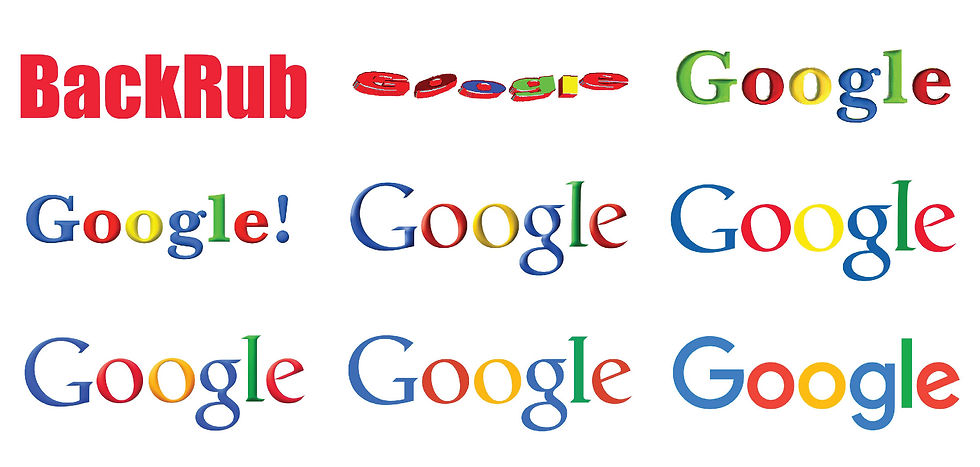
Another silly example of this is Google which was formerly known as BackRub until 1997. The founders created the search engine with a play on words referring to back-end links and searching them. Once Google had grown considerably, they worked with their team to find a new name. They eventually landed on Google and the rest is history. This is a great example of how a brand name was too niche by using jargon that is only known to a specific group of individuals. It may seem like a fun secret but it can confuse the wider audience you may eventually want.
These examples illustrate just some of the reasons a business might benefit from a logo rebrand. It is normal to change your logo over time as your business changes and grows. Don’t be afraid of the logo lifecycle. Embrace the change and you will see your customer base grow.
If you’d like help getting started, I would love to chat! Feel free to contact me and we can discuss if a rebranding is right for you and how I can help you achieve the polished look your business deserves.
Comments